

Bistro Palette

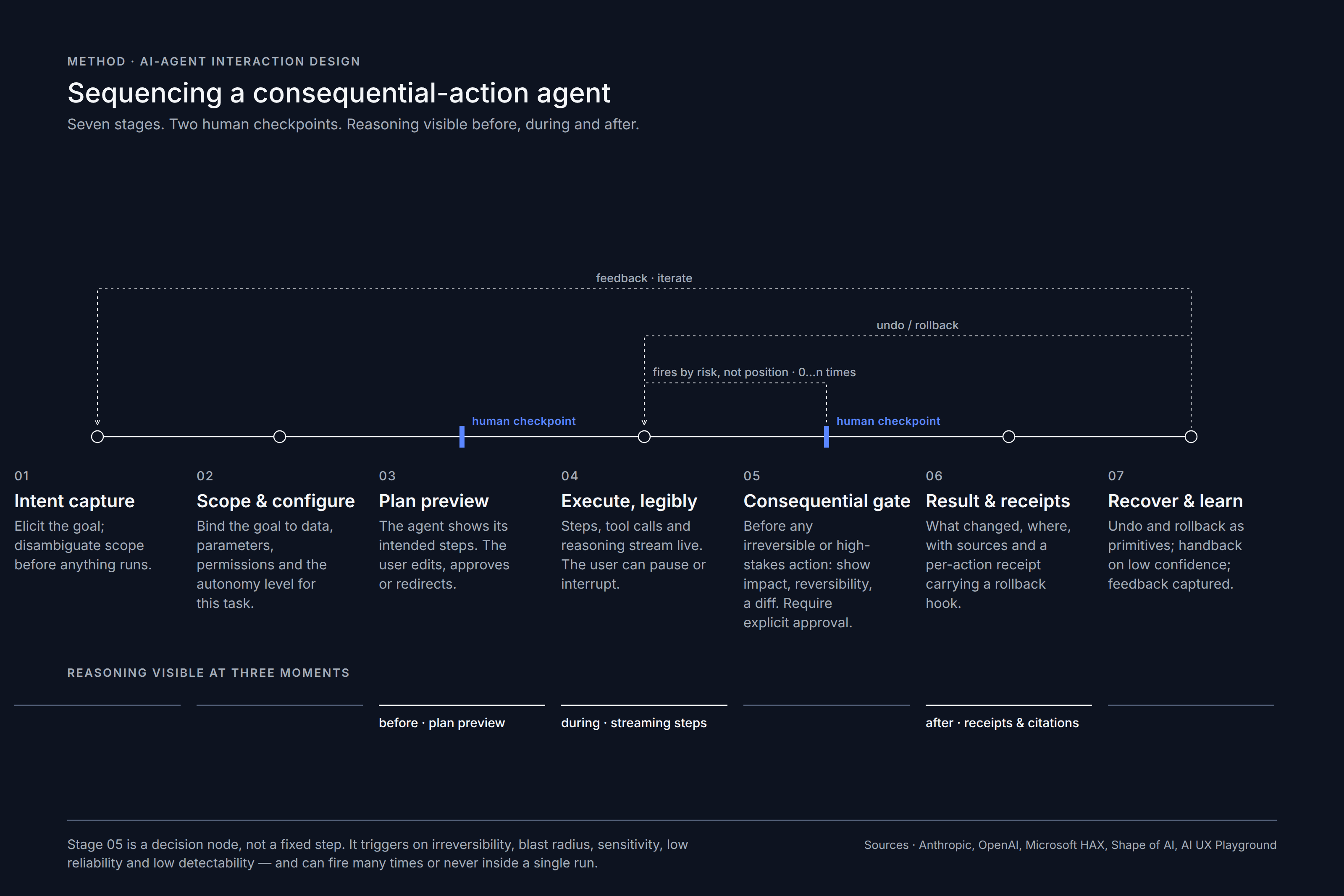
A Bangkok restaurant's whole brand — named for a palette, and composed like one.

Brand Strategy
Visual Identity
Interior Design
Photographic Direction
Role
Total brand direction — naming · logo & identity · menu & graphics · interior (3D → built) · art direction
Year
2023
Location
Bangkok
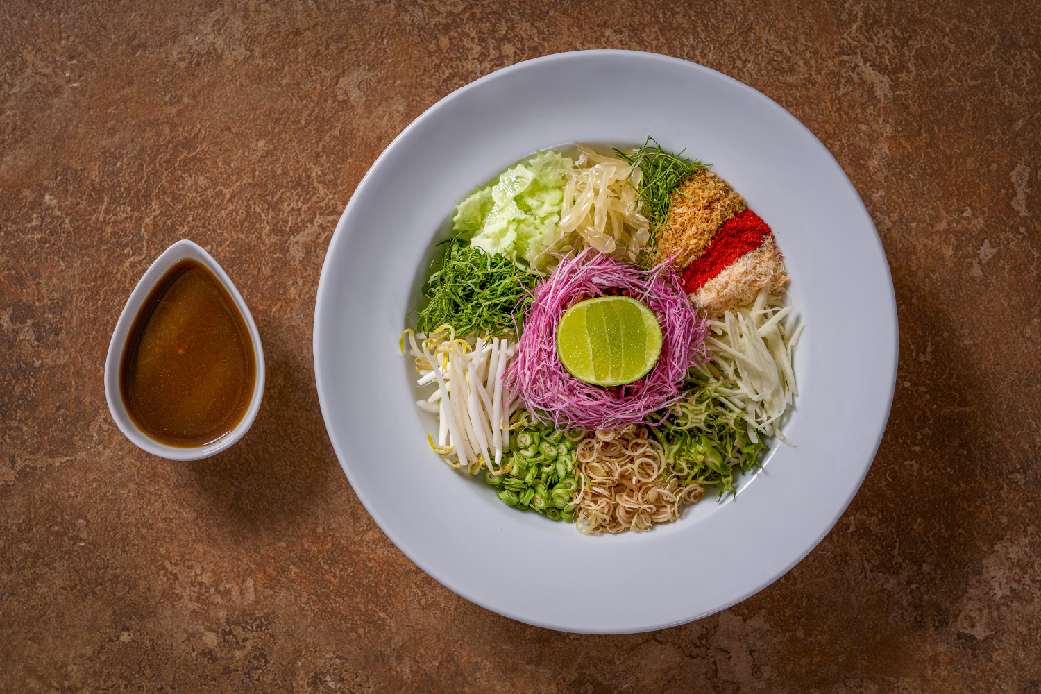
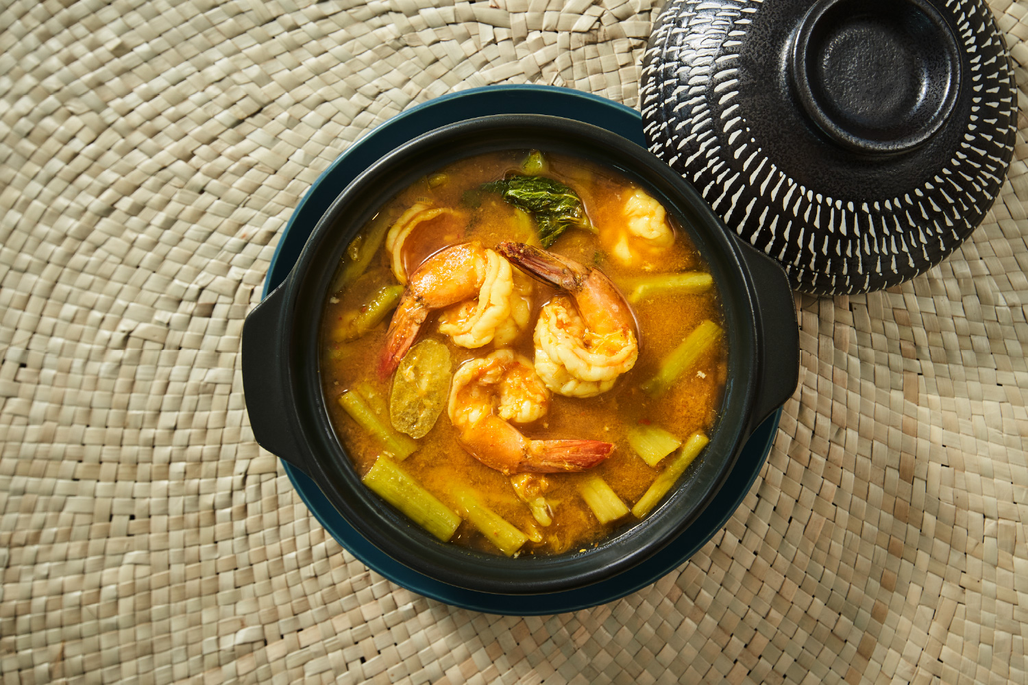
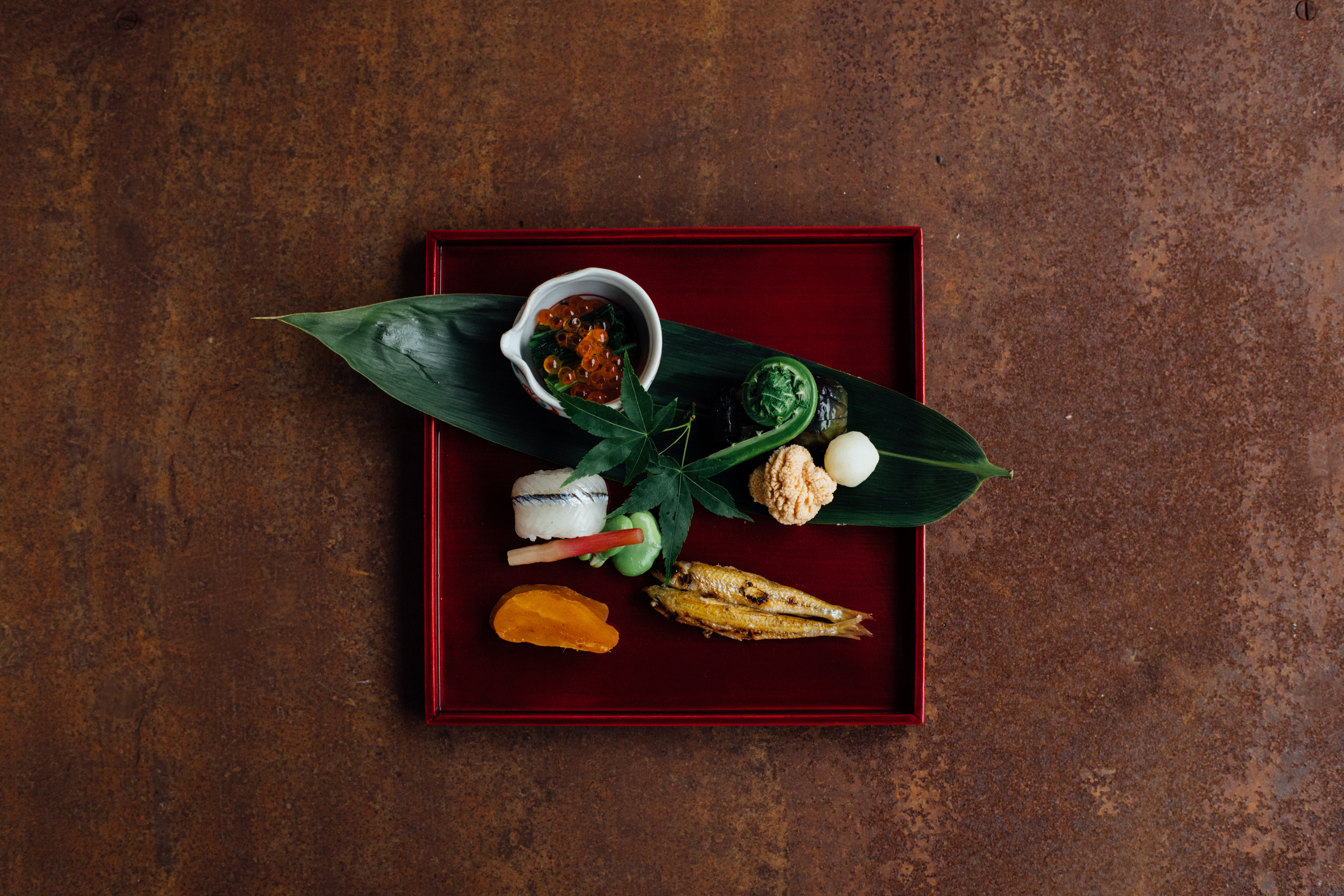
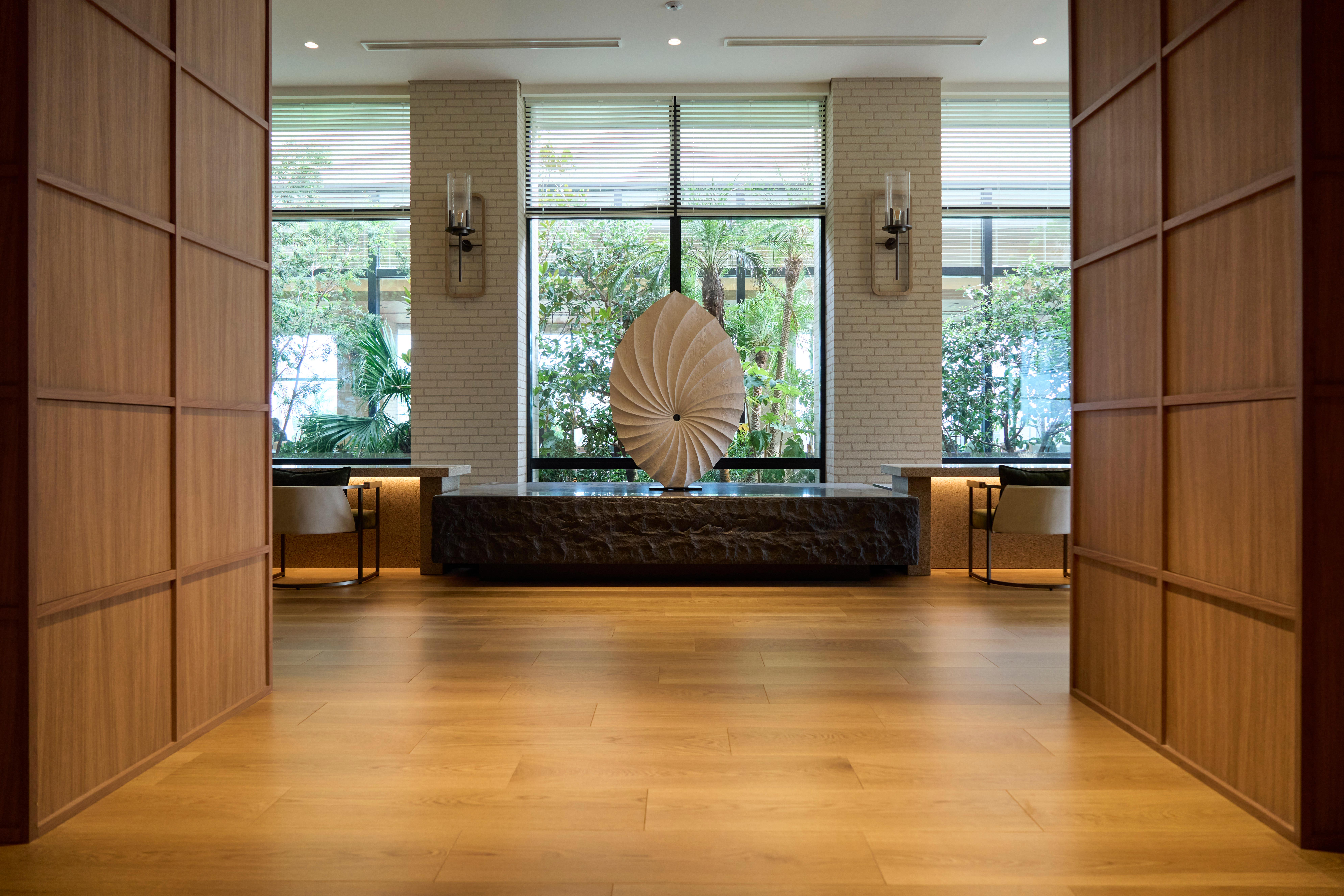
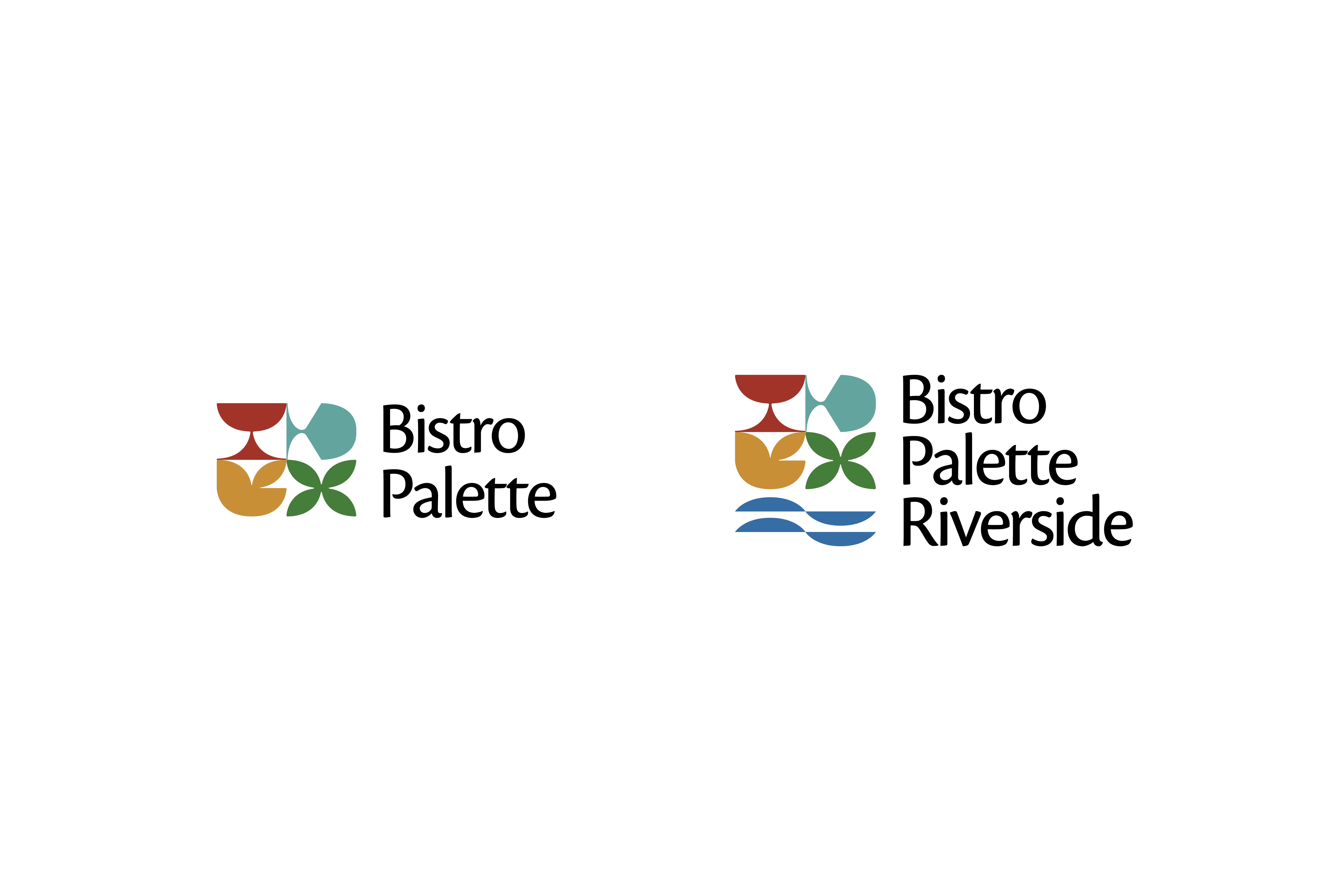
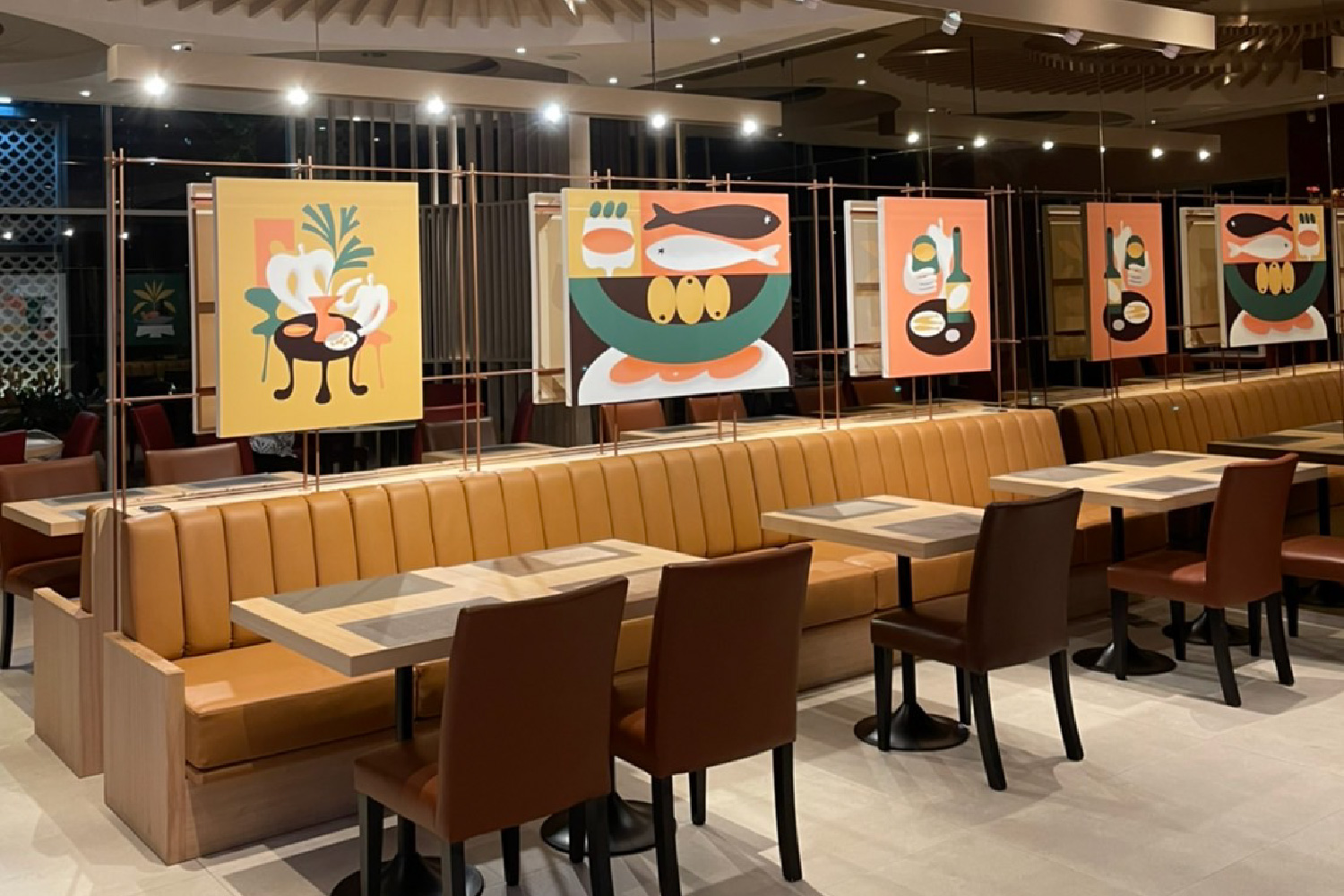
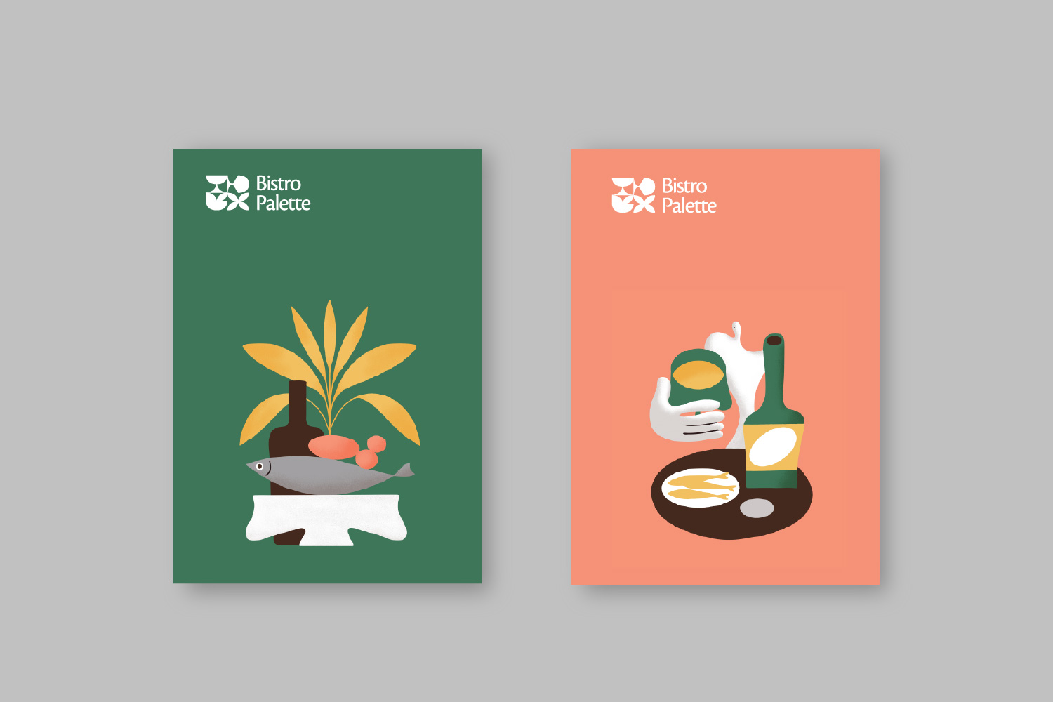
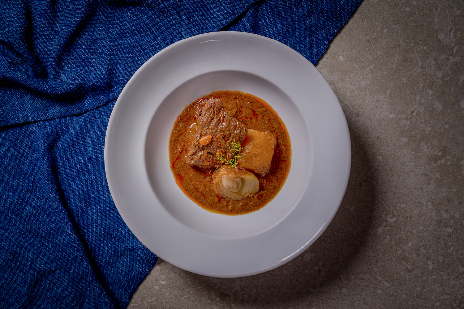
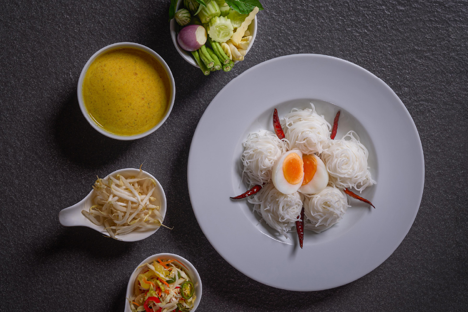
Bistro Palette is a Southern-Thai restaurant in Bangkok, brought into being as a single brand — from the name and identity to the menu, the graphics, the interior, and the art on its walls. The name set the idea and the method both: a palette is a range held in order, distinct colours that read as one composition. Southern Thai cooking works the same way — bright, layered, unmistakably itself — so I directed every layer to hold that range without muddying it. I ran the direction from Japan and saw it built on the ground in Bangkok; the brand is one composition, made to survive the distance.
No items found.
The Problem

A restaurant brand in a competitive Bangkok mall needs every layer to agree — name, identity, menu, interior, and art. Sourced from separate vendors, in separate countries, those layers drift, and the result feels assembled rather than composed. And here the direction had to hold across a border, from Japan, without losing the warmth and specificity that make a Southern-Thai table feel like itself.
No items found.
The Approach

The real problem wasn't designing a restaurant brand — it was holding one intention across a border, where name, interior, and art usually fracture between vendors and countries. I decided to be the single point of judgment for the whole chain, run from Japan: not to manage Thai execution, but to author the brand and see it built. The bridge isn't a service line; it's the method.
No items found.
The Solution

The naming and identity set the composition; the menu and printed collateral carried its colour; the interior — circular ceiling baffles, warm wood, banquette seating — I designed in 3D and saw through to build in Bangkok; and the wall art and signage I art-directed so the space signs itself. Each layer stays distinct yet reads as one palette — bright without turning loud, considered without turning cold. The Riverside identity extends the brand across outlets, so the composition holds not just across a room but across a growing relationship.
No items found.
Credits
Additional work
SOJYU
Arrow pointing right icon
Brand Identity
strangers
Arrow pointing right icon
Exhibition & Object
TAP
Arrow pointing right icon
Brand Identity
A live real-estate SaaS
Arrow pointing right icon
Digital & Systems
Bricole
Arrow pointing right icon
Spatial & Hospitality
PWS Shonan
Arrow pointing right icon
Art Direction & Curation
Ready for the next step?
Let’s bring your project to life
Get in touch
Get in touch