

.jpg)


5-1 Koishikawa
Bunkyo, Tokyo
Japan



Recruiting is a commoditized, trust-poor market. TAP needed an identity that signaled rigor and a digital presence that performed that rigor — not a static brochure site, and not a brand agency and a web shop pulling in two directions. The brand idea, the graphics, the motion, and the build all had to agree.

In a trust-poor market, rigor stated is rigor doubted. I decided the brand should demonstrate its precision rather than describe it — so the argument moved out of the copy and into behaviour: a mark that composes itself, a system that holds, a page that performs its own claim as it loads. Designing and building it as one continuous piece of work was what kept that argument honest.
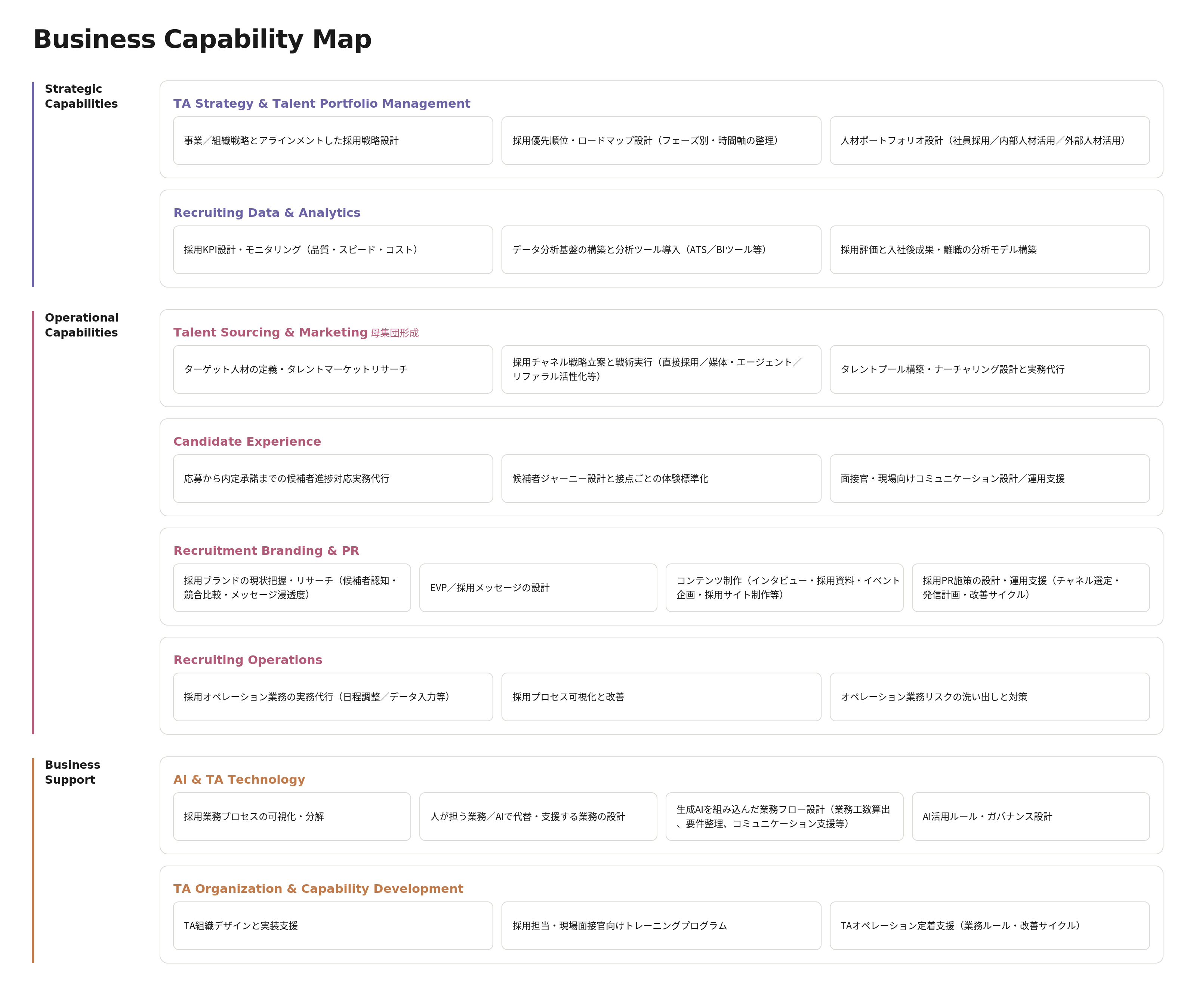
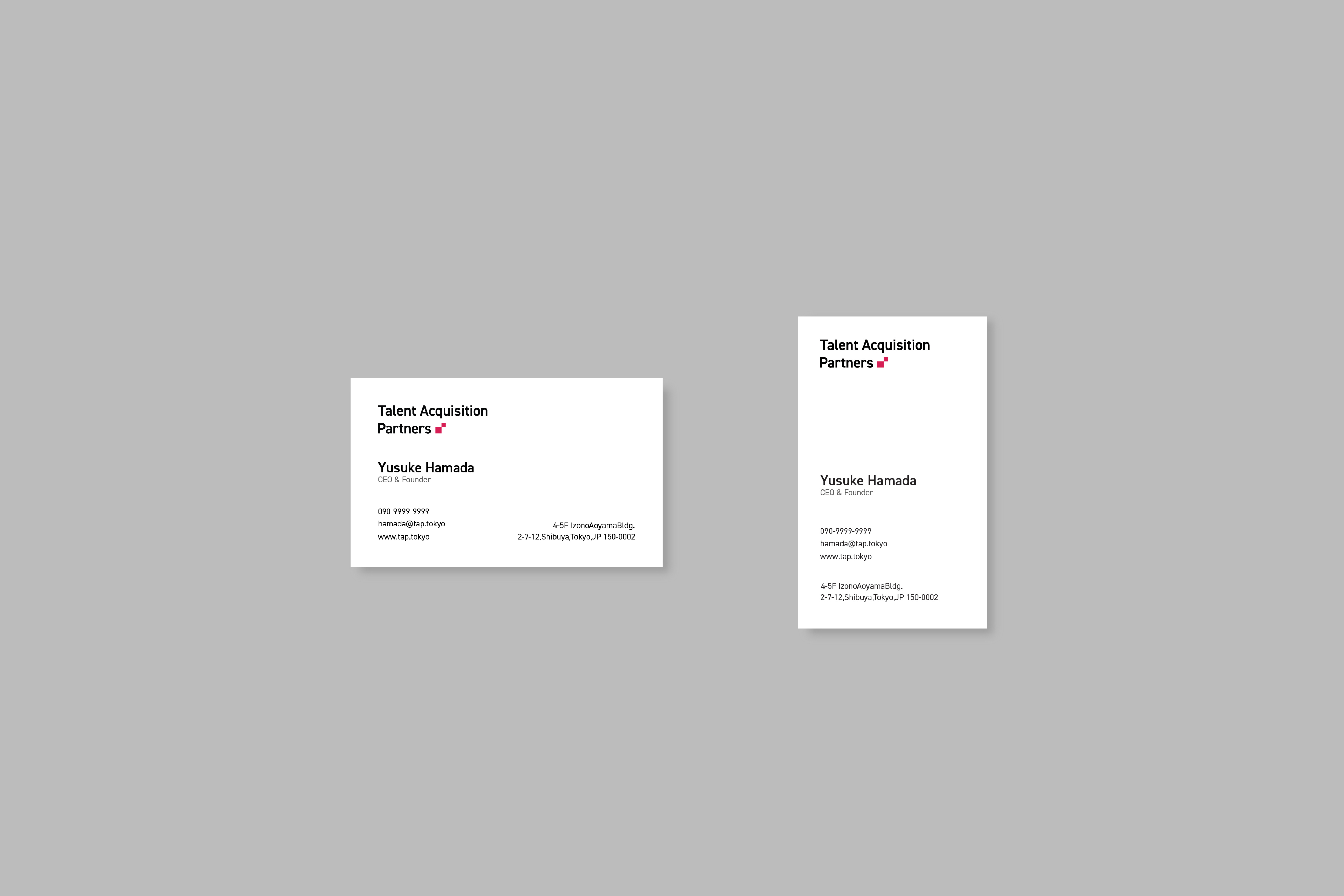
The identity system builds from a single modular unit: a square that multiplies into the logomark, the process icons, and the graphic language, with the Business Capability Map as its strategic counterpart — a real consulting artifact, not decoration. On the website, that same unit comes alive: a field of gradient squares scatters and settles into the mark on load, and scroll-linked motion carries the composure through the page. The animation reads as intent, not ornament — the brand's precision, performed. Carrying the work from strategy to a shipped, animated front end kept the idea continuous the whole way down.